BudgetCart
An online grocery app that eliminates checkout anxiety for budget-constrained shoppers
- Client
- Course Work Project
- Role
- Product designer
- Team
- Tunisia Smith, Dhwani Bagrecha
- Timeline
- 4 months (2025)

Problem
Shopping requires too much mental math
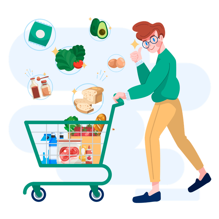
As graduate students ourselves, life is busy. We noticed that grocery shopping took far more mental energy than it should.
We often jumped between apps to compare prices, track budgets, and calculate totals. Yet None of these systems worked together.
But this wasn’t just our experience.
For budget-constrained shoppers, particularly those relying on SNAP/WIC, grocery shopping means managing multiple constraints at once.

The problem statement that guided this project was:
How might we help budget-conscious shoppers make confident grocery decisions without forcing them to constantly calculate budget, eligibility, and trade-offs in their head?
My role
In this project, I led the end-to-end design of core shopping experience.
Key responsibilities:
Led user research and problem framing
Designed the end-to-end shopping experience
Integrated budgeting and SNAP visibility into core flows
Iterated through prototyping and testing
Solutions Overview
Make Cost Visible Early in the Shopping Journey
Redesign the shopping flow
- → minimizing the step for compare price so shoppers don't need to rebuild cart to compare price.
Redesign the Information Architecture
- → Consolidate total cost comparison into one unified view.
Build a Budget Awareness System
- → Surface real-time budget signals to help users stay within limits.
Introduce Persistent SNAP Signals
- → Show coverage and out-of-pocket costs early to prevent checkout surprises.
Key Research Insight
Budget-constrained grocery shopping is a multi-constraint decision problem, not just price comparison

“I need to know I won’t go over my budget before I pay“
“Comparing stores is exhausting. I just want to know the best option for my situation.”
“I want to see how much SNAP/WIC I’m spending before checkout”
Target User
Budget-constrained shoppers or snap users who actively compare prices and track total spending to stay within a limited budget
Competitive Analysis
No existing tool integrates pricing, budgeting, and eligibility into one unified decision flow

Flashfood
Optimized for discounts, not total decision planning

Instacart
Optimized for convenience, not cross-store comparison

Walmart
Optimized for pricing, not integrated budgeting & eligibility
Budgetcart
Designed for unified financial decision-making
The burden of budgeting and eligibility decisions still falls on users
Design Opportunity
Address both user constraints and market gaps by redesigning grocery shopping as an integrated decision system
01.
COMPARISON EFFICIENCY
Redesign the flow so users compare stores without rebuilding carts.
02.
BUDGET AWARENESS
Provide continuous visibility into total cost and remaining budget before checkout
03.
ELIGIBILITY TRANSPARENCY
Surface SNAP coverage and out-of-pocket costs early in the journey
Design Breakdown
1. Minimizing the step for compare price
1. Redesign shopping flow
Impact: Users see the real total cost across stores without rebuilding cart to compare stores
In current shopping flows, users must commit to a store first, build a cart, manually compare across stores, and repeatedly rebuild the cart.
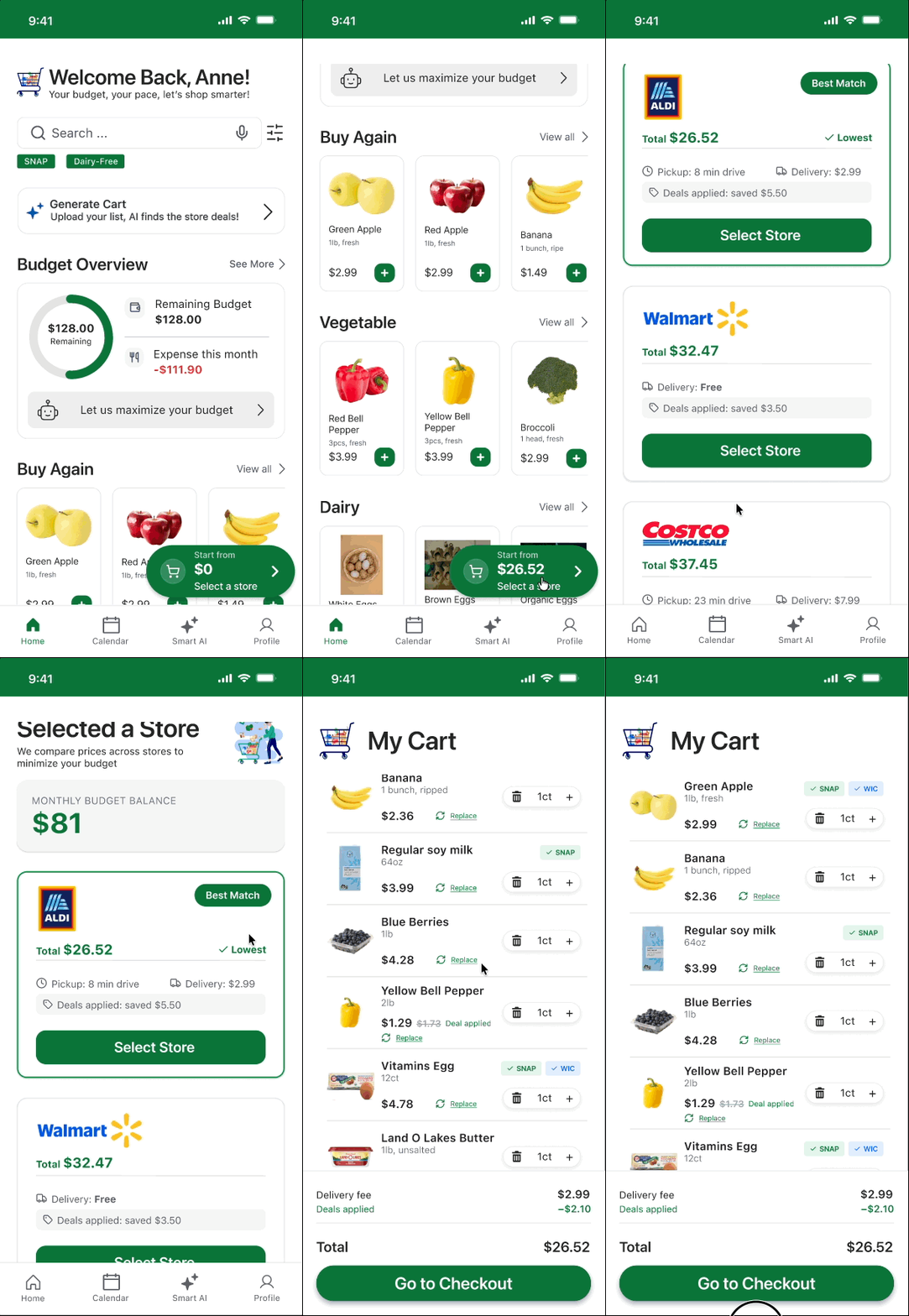
I redesigned the flow so users build the cart once, compare total costs across stores in one view, and choose a store only after seeing the complete cost breakdown.
Traditional Shopping Order:

BudgetCart Shopping Order:

Experience Walkthrough
1. Build cart once
Users add items to a single cart without selecting a store.
The cart is built only once.
2. Compare cost across stores before commitment
Instead of committing first, users see total cost across stores before choosing. Comparison happens before any checkout decision.
3. Select & Confirm cart
Only after reviewing the full cost picture do users select a store and proceed.
No cart rebuilding. No switching back and forth.
Reordering the decision flow eliminated cart rebuilding, but this shift wasn’t only about changing steps. It required rethinking how cost information is structured and surfaced
2. Redesign store comparison interface
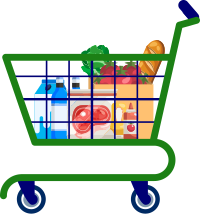
I redesigned the comparison interface so the system automatically applies the same cart across stores and surfaces total cost and trade-offs at a glance, reducing mental math and decision fatigue.
Making Total Cost Comparable at a Glance
1. Total Cost First
Each store shows the full cart total first, ensuring users compare final cost rather than piecing together item prices
2. Best Match Indicator
The system highlights the best value option to reduce cognitive load
3. Trade-off Transparency
Delivery fees, pickup time, and discount breakdown are surfaced inline
2. Create Budget Awareness System
Impact: Users gain continuous visibility into spending — before, during, and after purchase
I designed a budget awareness system that provides real-time financial visibility across the entire shopping journey from building cart to checkout
Before Shopping
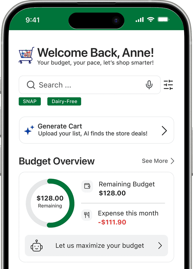
1. Ongoing Budget Overview
Users can see their remaining monthly budget directly on the home screen, giving them a clear sense of how much they can afford before they start shopping
During Shopping

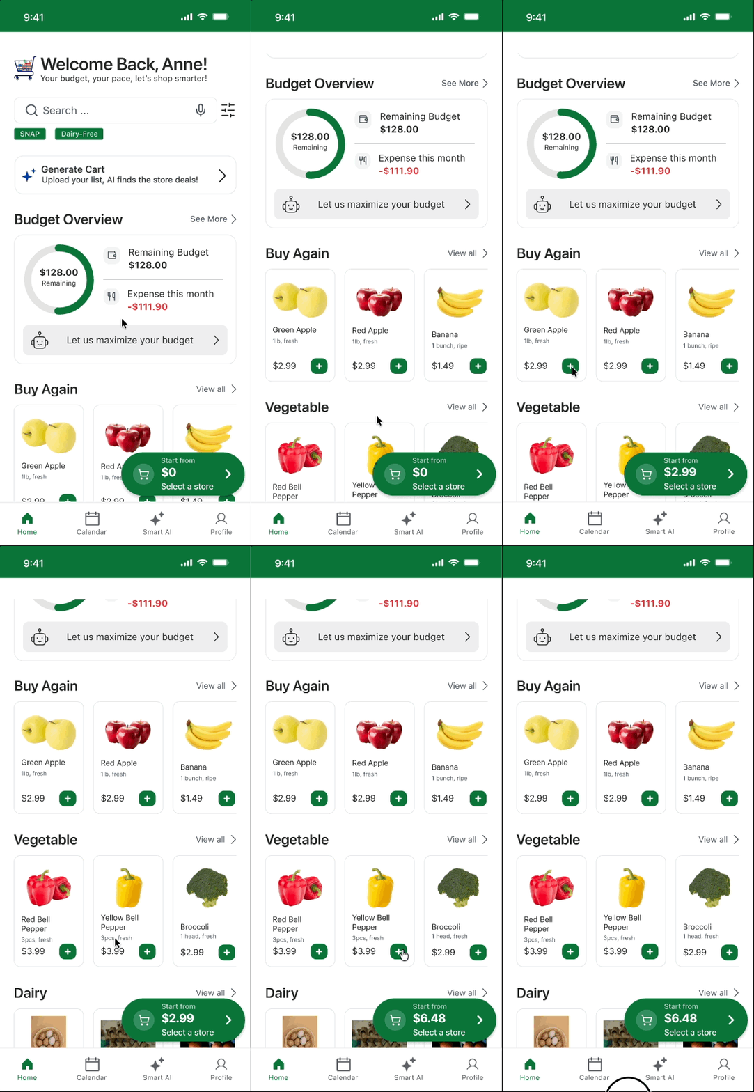
1. Live Cart estimator
As users add items, a floating cart estimator updates in real time, keeping users aware of how much they’ve already added to the cart
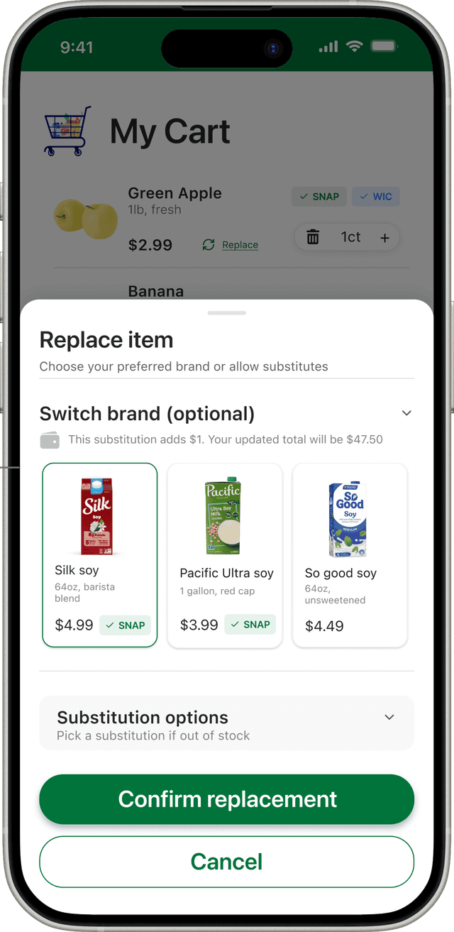
2. Replacement Alert
If a replacement increases the total cost, users are notified before confirming the change
After Shopping
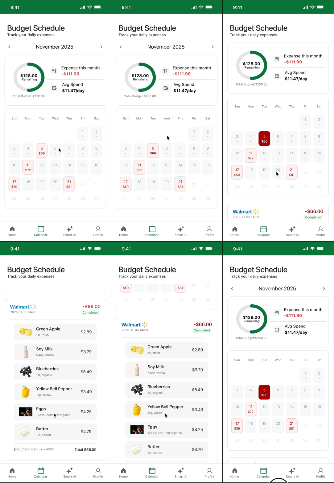
1. Budget Tracking Calendar
The Budget Calendar helps users review daily spending and access receipts, reinforcing long-term budgeting behavior
1. Ongoing Budget Overview
Users can see their remaining monthly budget directly on the home screen, giving them a clear sense of how much they can afford before they start shopping
3. Make SNAP benefit visible at every decision point
Impact: SNAP users can clearly understand how their benefits are applied and how much they will pay out of pocket before making decisions
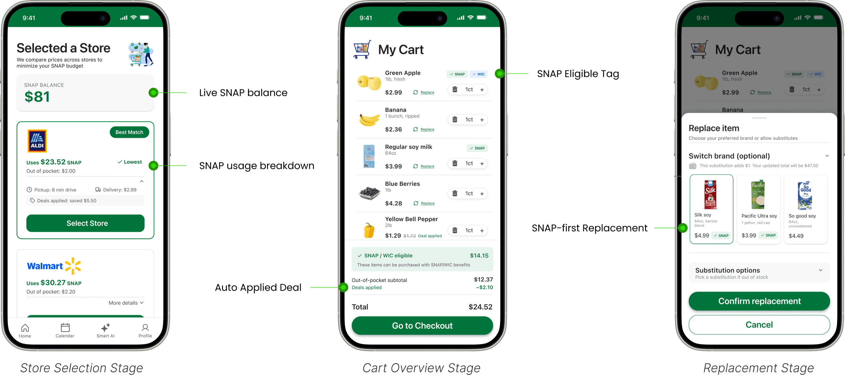
SNAP users often struggle to understand how their benefits apply across different stores and items.
I introduced clear SNAP signals at every key decision point, helping users maximize benefits and avoid unexpected out-of-pocket costs.
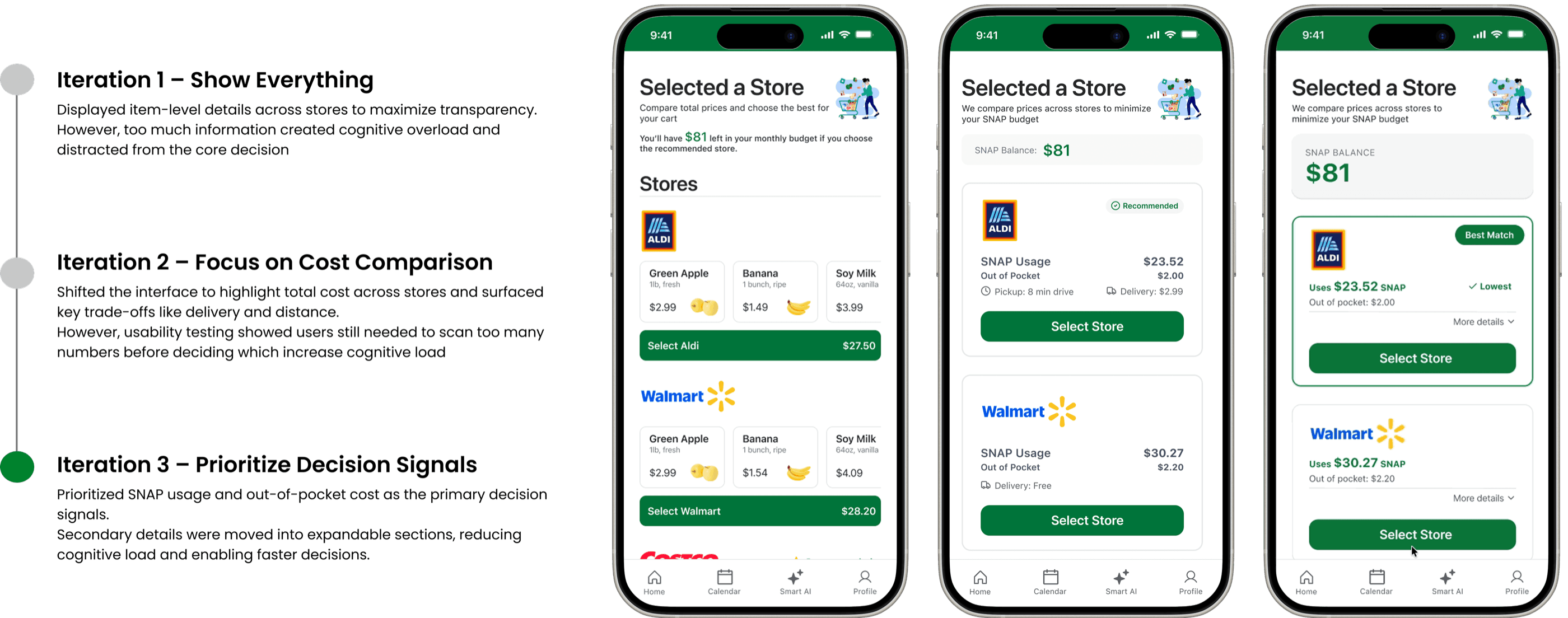
Design Iteration
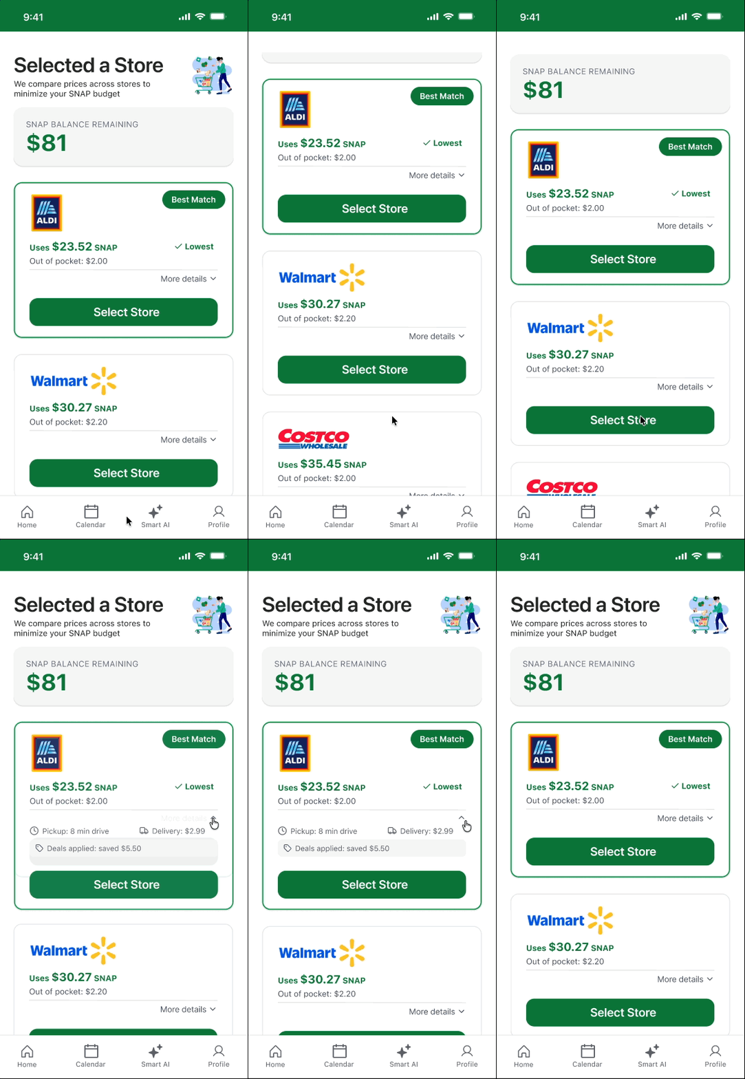
Iterating Toward Clearer Store Comparison
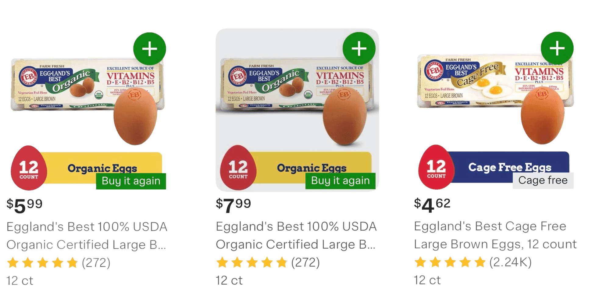
Through iterative design and usability testing, I refined how store comparison information is structured so users can make faster, lower-effort decisions.
Next Steps
Explore an AI-powered shopping assistant
Users could upload a grocery list and the system would automatically generate a cart optimized for their budget.
This assistant could help users quickly identify the most affordable store and maximize SNAP usage without manually comparing prices.
Conduct deeper testing with SNAP users
Due to limited access to SNAP participants, many early design decisions were informed by one interview and secondary research.
With more time, I would recruit more SNAP users to better understand their real budgeting behaviors and evaluate whether the solution truly reduces decision anxiety during real shopping scenarios.
Reflection
What I enjoyed most about this project was seeing how quickly design ideas evolved through iteration. I learned that weekly deliverables weren’t meant to be the final solution, but an opportunity to test ideas and refine the design. Each round of feedback helped clarify what actually mattered to users.
One of the biggest lessons for me was learning how to balance transparency and simplicity, making important information visible without overwhelming users with too many details. This project also strengthened my ability to iterate quickly and refine designs based on user feedback, especially when working through complex decision-making scenarios.