Ryze Coffee WEB Redesign
Redesigning with user trust and autonomy for long-term retention
- Client :
- Ryze coffee (Coursework Project)
- Role :
- UIUX designer/ Researcher
- Team :
- Anne Lin, Tuyara Chinbat
- Duration :
- 4 weeks (2026)
Project context
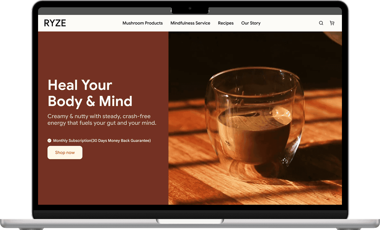
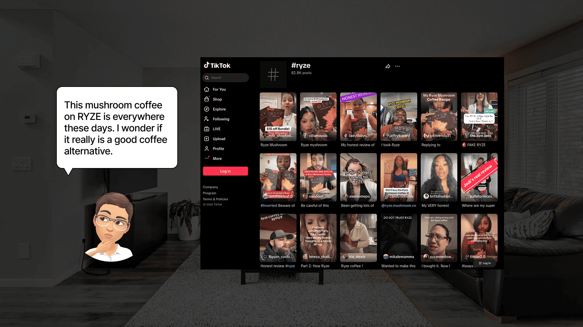
Ryze is a fast-growing wellness brand known for its mushroom coffee, which has gained popularity largely through social media and word of mouth.
However, while the product itself is appealing, the website experience does not reflect the same level of trust and clarity. Many users visit the site looking for a healthier coffee alternative, but struggle to understand the product, the purchase model, and the overall value.
This project focuses on redesigning key user flows to improve trust, transparency, and decision-making, ultimately supporting long-term customer retention.
Problem
Problem 1 — Lack of transparency in the subscription model
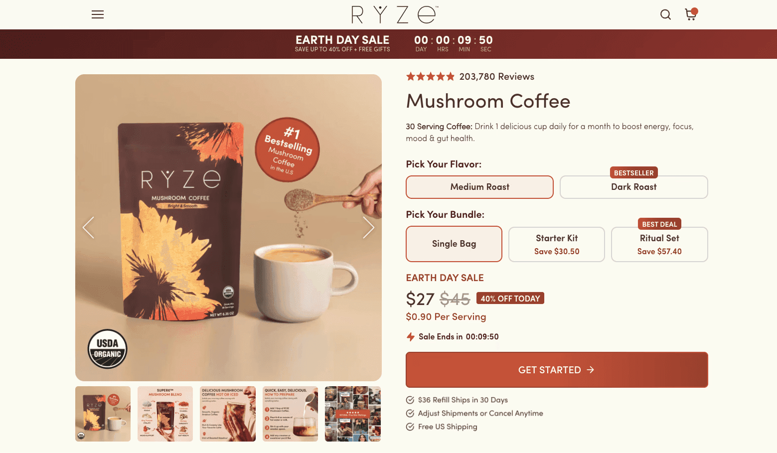
The subscription is often disguised as a one-time purchase. Users frequently do not realize they are subscribing until checkout, or even after being charged.
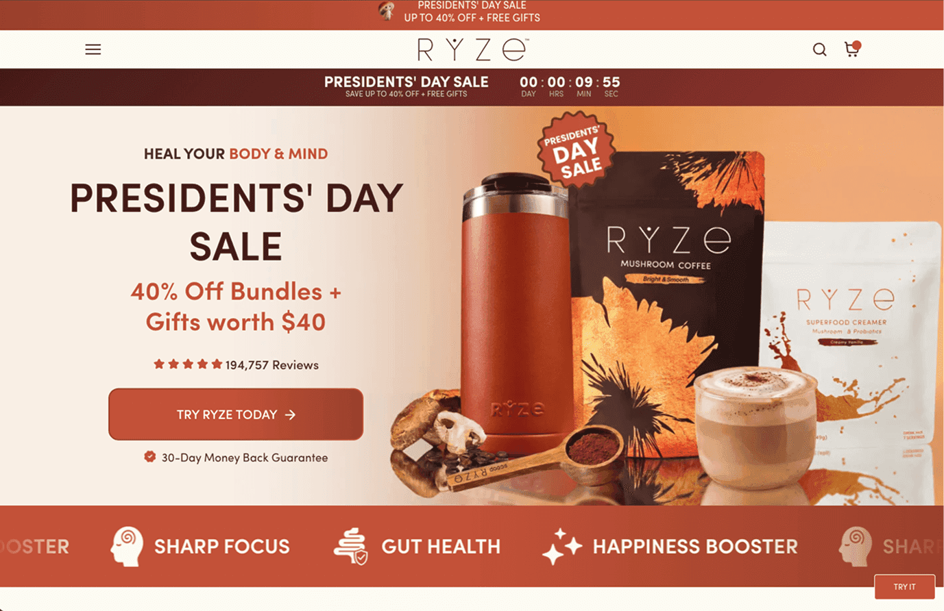
Problem 2 — Overwhelming and promotional-heavy interface
The interface relies heavily on repeated promotions and urgency tactics (e.g., countdown timers), which increase cognitive load and pressure users into quick decisions.
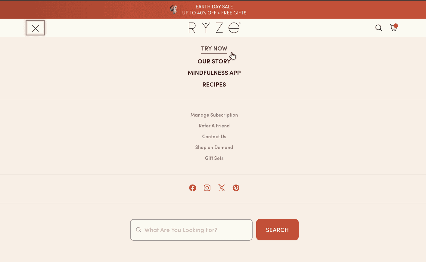
Problem 3 — Misleading and unclear communication
Important information is hidden in fine print or unclear wording (e.g., “Try now”), making it difficult for users to understand what they are purchasing or how the service works.
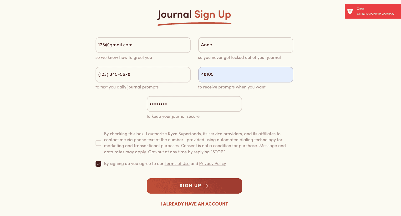
Problem 4 — Forced consent for marketing communication
Users must agree to receive marketing messages to access the service, reducing user control and trust.
🚫 Overall Impact
- Reduced user control and trust
- Confusion during decision-making
- Risk of unintended subscriptions
- Negative long-term brand perception
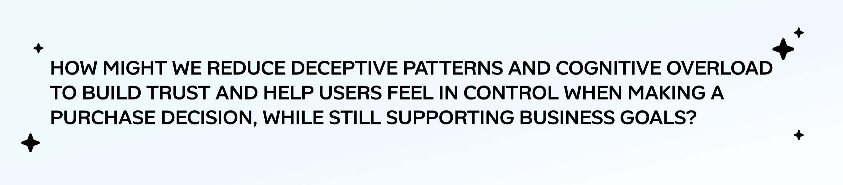
The problem statement that guided this project was:
My role
In this project, I led the redesign of Product page, shopping cart and Hero Section on the home Page
Key responsibilities:
Identified usability issues related to trust, clarity, and subscription transparency
Translated research insights into design solutions that reduce cognitive load and improve decision-making
Improved information hierarchy and CTA clarity to better communicate product
Collaborated on usability testing and iterated designs based on user feedback and behavioral insights
Solutions
Redesigned the experience with a focus on clarity, transparency, and user autonomy
Make the subscription model explicit
- Reworded CTA (e.g., “Subscription”)
- Clearly stated recurring payment details
Reduce cognitive load
- Removed excessive promotions and countdown timers
- Simplified layout and improved information hierarchy
- Surfaced key product details (e.g., nutrition, pricing)
Improve clarity and trust
- Replaced ambiguous wording with direct language
- Clarified navigation and product categories
- Made service descriptions more accurate
Support user autonomy
- Removed forced marketing opt-ins
Explore our Prototype here🔗
Research Process
target user
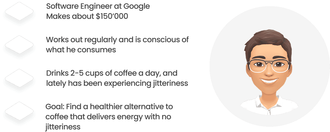
Health-conscious individuals who are looking for a healthier alternative to coffee and are interested in improving their daily wellness habits.
PersonA
Before jumping into the design, we wanted to understand our users better.
So we created a persona to represent our target user. This helped us identify key pain points and opportunities for improvement.
Journey Mapping
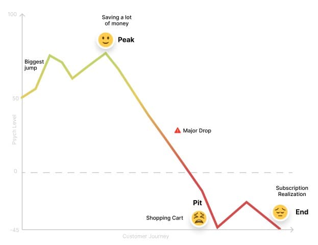
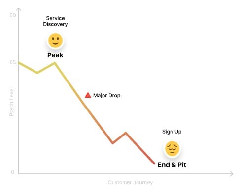
Based on this persona, we mapped out the user journey and identified key moments in the experience, including the peak and the pit.
Users feel excited during product discovery, but their experience drops significantly during checkout, especially when they realize it is a subscription.
Product Purchase Flow
Service sign up flow
Usability Testing
Based on this journey map we identified potential pain points in the user experience.
To validate these assumptions, we conducted usability testing on two key flows.
Flow 1: Purchase & Checkout
Goal: Evaluate trust, clarity, and decision-making
We tested:
- Can users complete the purchase without confusion?
- Do users realize it is a subscription?
- Do users feel confident and trust the website?
- How do users react when they discover the subscription?
Flow 2: Mindfulness Service Sign-Up
Goal: Evaluate understanding and perceived value
We tested:
- Can users find the service?
- Do they understand what it does?
- Do they understand how it works?
- Are they comfortable providing their information?
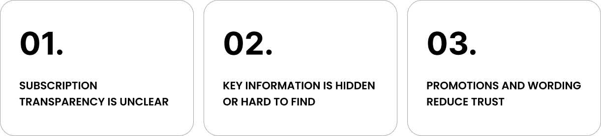
Pain points
Through the usability testing, we identified several key issues…
SOLUTIONS
MAKING THE EXPERIENCE CLEAR, TRANSPARENT, AND TRUSTWORTHY
1. Simplified UI to reduce cognitive load
The biggest drop in the user journey occurred when users were overwhelmed by excessive information and promotional elements like countdown timers.
To address this, we reduced visual clutter and unnecessary promotions, helping users focus on the most relevant information and better understand what they are viewing.
2. Redesigning the checkout flow to provide transparency to the subscription model
Many users did not realize they were subscribing until reaching the checkout—or even after completing the purchase.
The subscription model was not clearly communicated. Key details were hidden in small text or secondary areas, and the CTA did not indicate that the purchase was a recurring subscription.
As a result, users often misunderstood the purchase as a one-time transaction, leading to confusion and loss of trust.
To address this, we focused on making the subscription model more explicit and visible throughout the flow.
- Changed the CTA to “Subscription” to clearly communicate the purchase type
- Reworded the subscription details to explicitly state it is a monthly recurring charge
- Clearly surfaced a “Monthly Subscription” section in the cart to reinforce the model before checkout
These changes help users better understand what they are purchasing and reduce the risk of unintended subscriptions.
3. Providing decision autonomy and information privacy
In the mindfulness flow, the biggest drop occurred when users realized the service was a texting service rather than an app.
Users were also required to provide unnecessary personal information and agree to marketing communication, which made the experience feel intrusive and frustrating.
In our redesign, we focused on improving transparency and giving users more control.
We clarified how the service works, reduced the amount of required information, and made marketing opt-in optional.
This creates a more transparent and respectful experience, helping users feel more comfortable signing up.
RESULT & IMPACT
Validating the Redesign
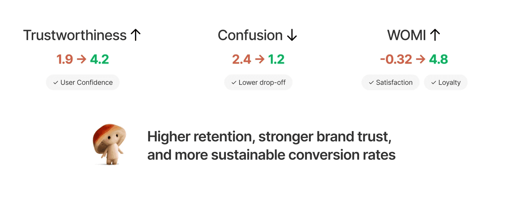
We conducted A/B testing with 5 users to evaluate the impact of our redesign.
Each participant interacted with both the current website and our redesigned prototype. Afterward, we asked them to rate their levels of confusion, trust, and their likelihood to recommend or discourage others from purchasing for each version.
Next Steps
For next steps, we prioritized solutions based on feasibility, user impact, and business goals.
First, we would remove countdown timers and excessive promotions. This is low effort and helps build trust.
Second, we would clarify the subscription model through improved wording and CTA, which has high impact on transparency.
Third, we would redesign the homepage to better highlight the product and brand, creating long-term value.
Lastly, we would redesign the mindfulness service page, which we deprioritized for now and plan to improve in the future.