Taipei Metro Point Redesign
Reimagining Metro Points to make rewards visible, understandable, and part of everyday commuting
- Client
- Taipei Metro Company
- Role
- UI/UX designer
- Team
- Hao Liu, Alexis Chung, Woody Wu
- Timeline
- 6 weeks (2025)

Project context
Unlike most U.S. metro systems, Taipei Metro stations function as both transit spaces and everyday shopping hubs. Many stations integrate convenience stores and local retailers, making daily commuting a key driver of local commerce .
Over the past decade, operating costs continued to rise while metro fares remained unchanged. As a result, Taipei Metro faces growing financial pressure and increasingly relies on non-fare revenue from station-area businesses.
This is why Metro Points was introduced to turn daily commuting into a reward-based system that supports riders, local businesses, and the metro’s financial sustainability.
The Taipei Metro Go app serves two core functions:
Metro Navigation
- Real time train arrival times
- Metro route planning
Metro Point (Shopping)
- Earn points by participating in in-station activity
- Redeem rewards at in-station partner stores
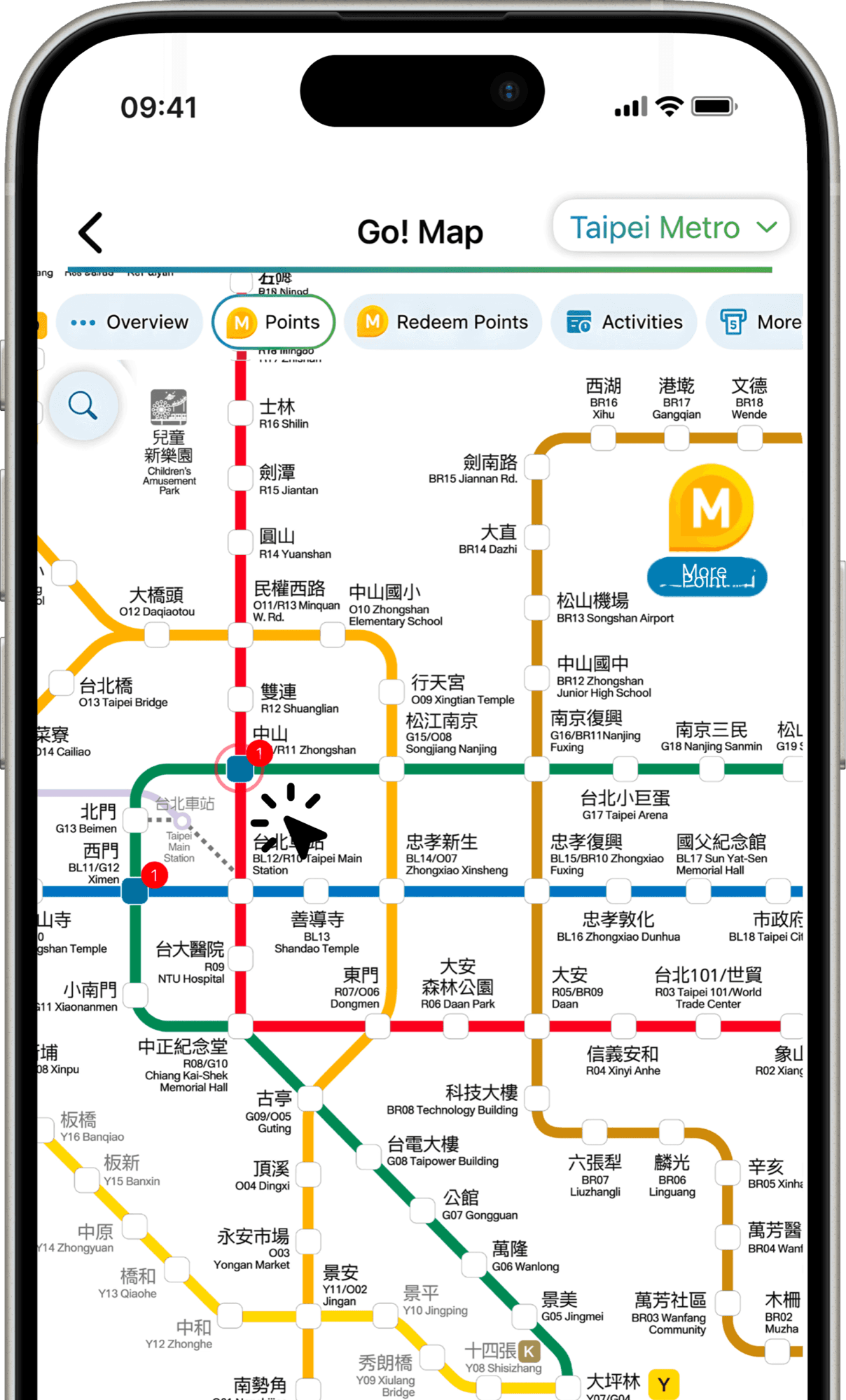
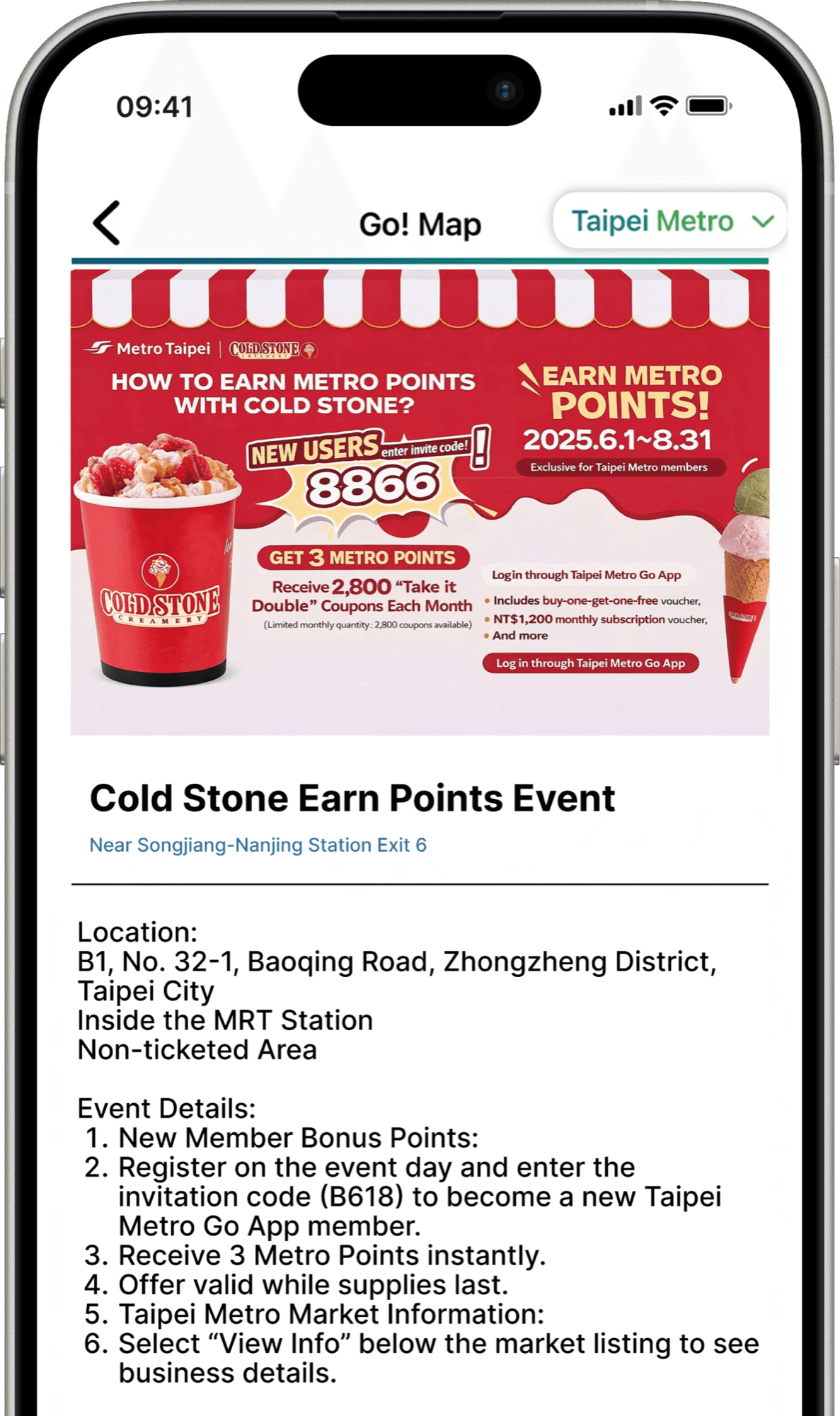
However, Data Showed That Nearly 72% Of App Users Never Engage With Metro Point, This Is A Significant Revenue Gap For The Metro Company
 Why?
Why?
Today's Focus
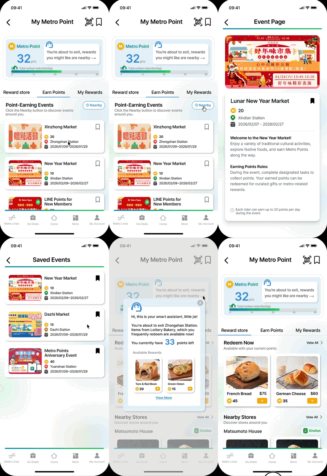
Redesigning the “Collect/Redeem Points” experience
While navigation fulfills a core functional need, Metro Points plays a critical role in long-term engagement and financial sustainability. Hence,this project focuses on improving Metro Points adoption.
I focused on redesigning the Collect Points page, where riders are expected to understand:
- How points are earned
- What actions they should take
- Why Metro Points are relevant to daily commuting
Problem
Metro Points had business potential but failed to become part of daily commuting
Despite strong business intent, Metro Points failed at the experience level.
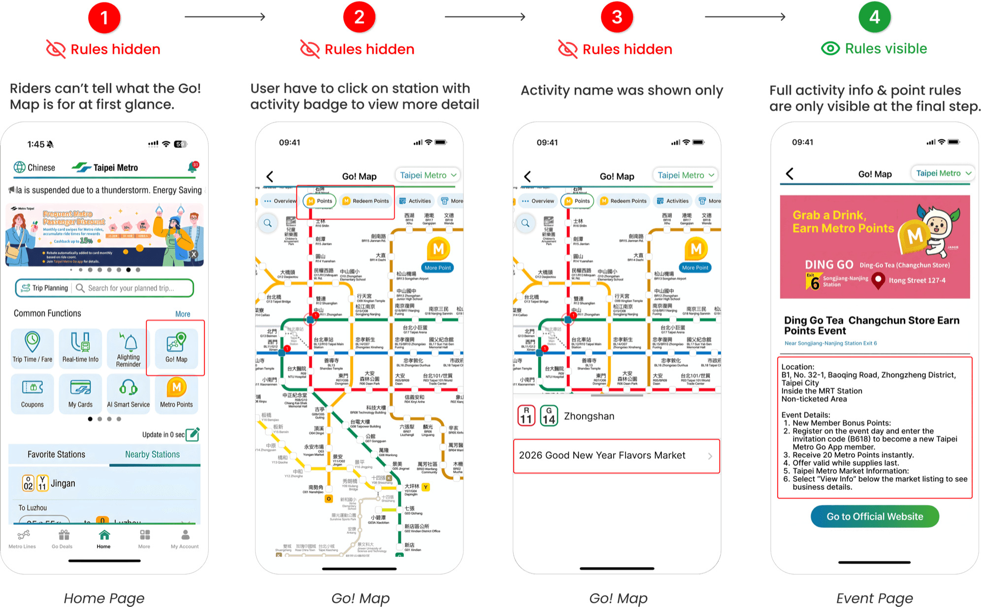
Through user interviews and flow analysis, we identified two core problems:
Problem 1 — Value was buried too deep
Users needed multiple steps just to evaluate earning value.
Rules and rewards were only visible at the final screen.
Problem 2 — Rewards felt disconnected from commuting behavior
Most riders expected to earn points simply by riding the metro.
Instead, points can only earn through participating in specific partner events at designated stations.
Since these activities were often outside users’ regular routes and unrelated to riding itself, the system felt disconnected from everyday travel.
The problem statement that guided this project was:
How might we make Metro Points immediately understandable and actionable, so riders can decide whether to engage without searching, guessing, or extra effort?
My Role
In this hackathon project, I led the redesign of Metro Points reward system.
Key responsibilities:
Identifying adoption barriers
Aligning incentive structure with daily commuting
Redesigning visibility and earning logic
Solution Overview
Making Metro Points Visible, Clear and Actionable
Give Metro Points a Clear Home
- → Consolidate all point-related information into a single, dedicated entry.
Make Rewards Visible and Actionable
- → Earning and redemption information is surfaced clearly within a single interaction, allowing riders to understand value and take action at a glance.
Redefining Metro Points as a Meaningful Reward System
- → Converted distance-based fare discounts into visible Metro Points, aligning the reward system with riders’ daily commuting behavior.
Introducing Little Jie: A Personalized Reward Assistant
- → Providing timely, personalized reward suggestions based on location, remaining points, and past behavior—making rewards easier to discover and more likely to be used.
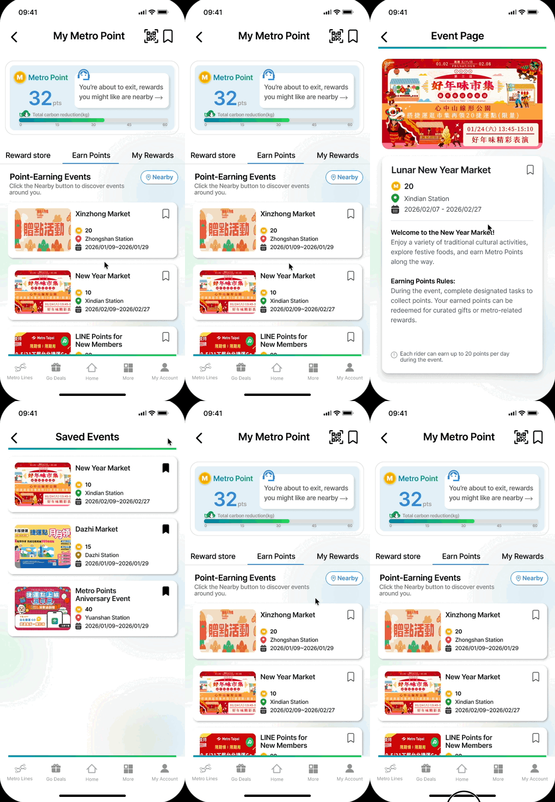
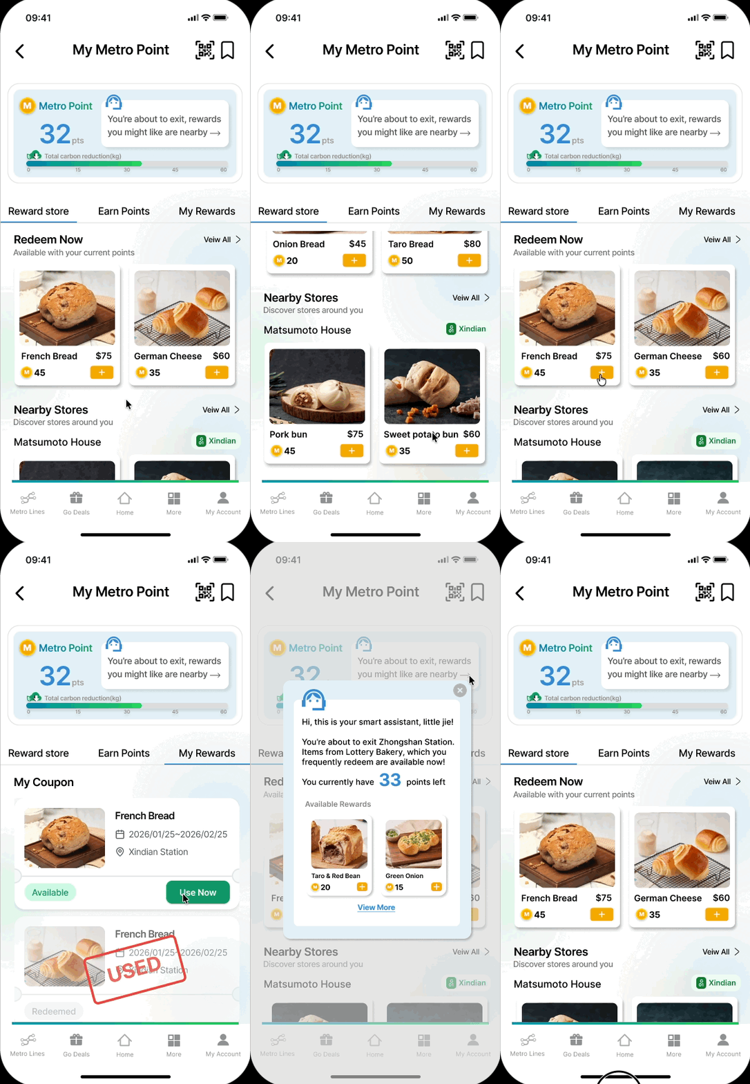
User Recruitment & Survey Strategy
To ensure we gathered diverse and representative insights, we first defined three user groups based on their level of engagement with the app and the Metro Points feature, specifically by (1) frequency of app usage and (2) interaction with Metro Points.
Based on this segmentation, we designed and distributed a screener survey to recruit and filter participants for user interviews, ensuring each group was appropriately represented.

Key Research Insights
Riders didn’t perceive Metro Points as part of their daily commute
The system required extra effort, and rewards felt disconnected from everyday travel behavior
“I don’t really understand what Go! Map is for. It looks like the metro route page, so I don’t know how to use it.”
“I don’t really understand how to collect or use Metro Points.”
“I would use Metro Points more if the rewards were actually relevant to my daily commute.”

Pain points
01.
VALUE IS HIDDEN BEHIND LAYERS
02.
THE EARNING LOGIC IS UNINTUITIVE
03.
REWARDS LACK CONTEXTUAL RELEVANCE
Target User
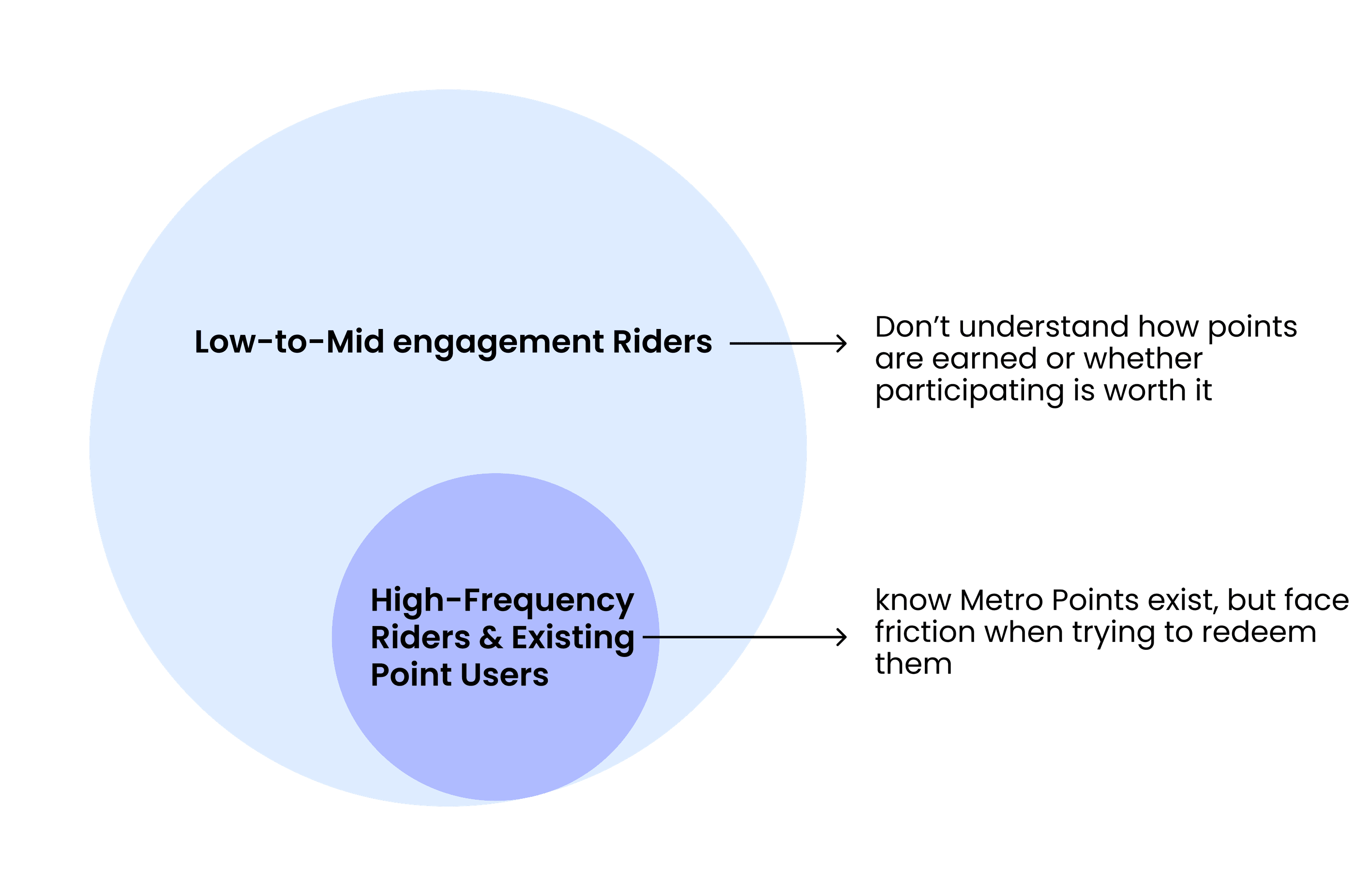
While we initially segmented users into three groups, our interviews revealed that medium-engagement users and potential users both lacked awareness and understanding of the Metro Points feature.
As a result, we grouped them together into a single segment focused on clarity challenges.
1. Low-to-mid engagement riders
→ Make Metro Points visible, understandable, and effortless to start using.
2. High-frequency riders & existing point users
→ Reduce friction by surfacing relevant rewards at the right moment.
Reward System Comparison
Metro Points: High Potential, Underutilized System
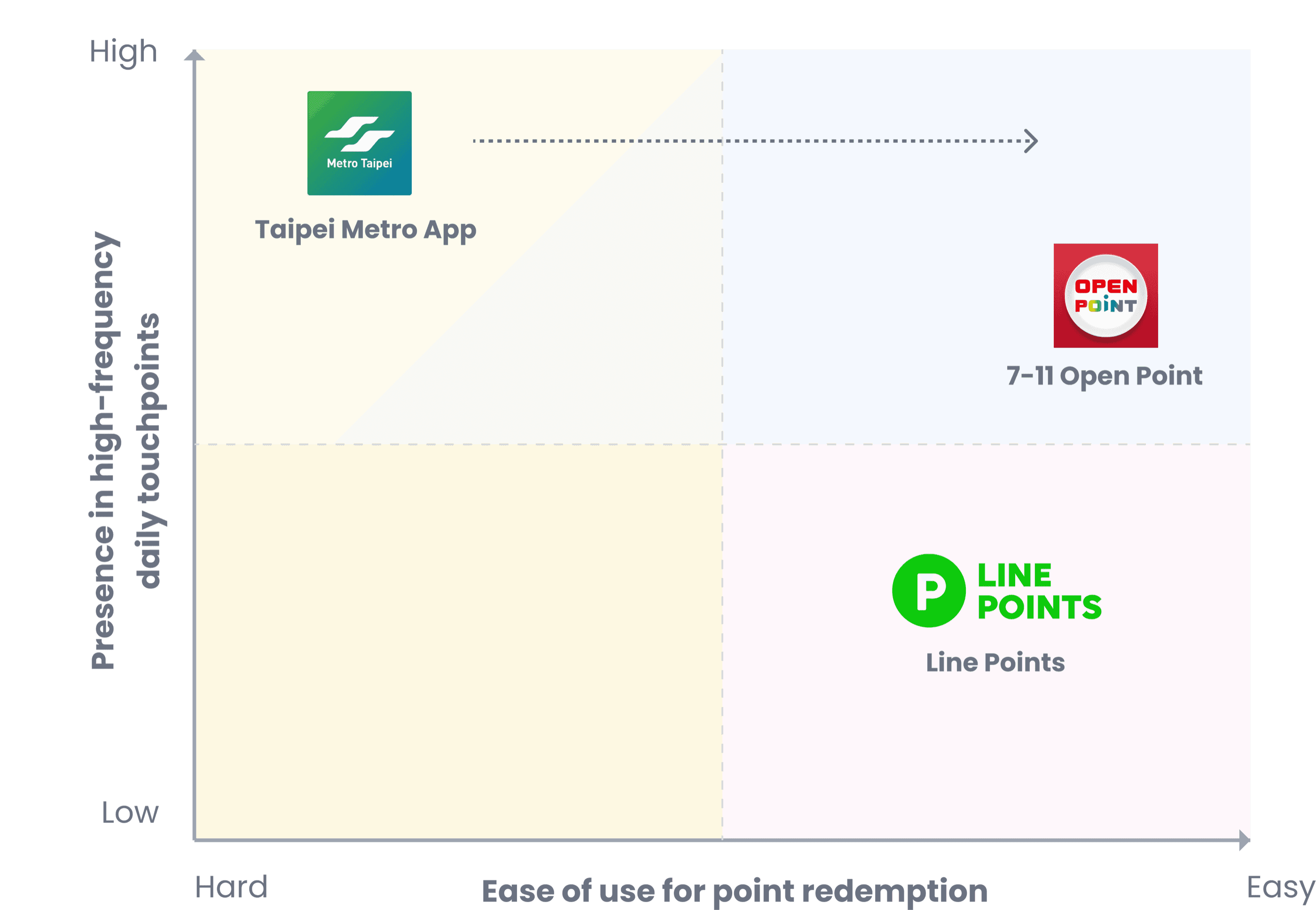
Metro Points sit in high-frequency daily touchpoints
→ High exposure
However, unclear earning logic and poor value visibility
→ Low usability & weak value framing
As a result, high exposure fails to convert into meaningful engagement
due to unclear earning logic and weak value visibility.
Design Strategy
Instead of optimizing isolated features, I redesigned the reward system around how riders experience value during their daily commute.
01.
Value must be visible before effort is required
Users need to understand what they can earn at a glance
02.
Metro Points need a clear and dedicated entry
Separate Metro Points from the commuting map to reduce confusion
03.
Commuting should be part of the reward system
Points were only earned through special events, making the system feel unrelated to everyday rides
04.
Rewards should appear at relevant moments during commuting
Rewards were not surfaced during the commuting journey, requiring users to search instead of discover them naturally
Strategy Evolution
- 1
Iteration 0
Improving Surface-Level Visibility
I improved discoverability, but engagement didn’t change.
- 2
Key Insight
Visibility Wasn’t the Core Problem
Riders rarely noticed Metro Points during everyday commuting. Rewards were tied to special events, not daily travel. This revealed a mismatch between the system and riders’ mental model of value.
- 3
Iteration 1
Making Value Continuous
We reframed Metro Points around daily commuting to build familiarity.
- 4
Iteration2
Making Value Situational and Actionable
Daily exposure increased awareness, but didn’t always lead to action.
- 5
Final Direction
A Layered Reward System
The final design evolved Metro Points into a layered system:
- Baseline exposure through daily commuting builds familiarity and trust
- High-value accelerators (markets and events) provide meaningful incentives tied to real-world actions
- Contextual cues and recommendations guide riders toward relevant opportunities without overwhelming them
Result
Metro Points transformed from an event-only reward into a system that makes value visible every day—while preserving markets and events as the most meaningful and economically aligned paths to earning.
The goal wasn’t to force engagement, but to make participation feel reasonable when the moment was right.
Design Breakdown
Making Metro Points Visible, Clear and Actionable
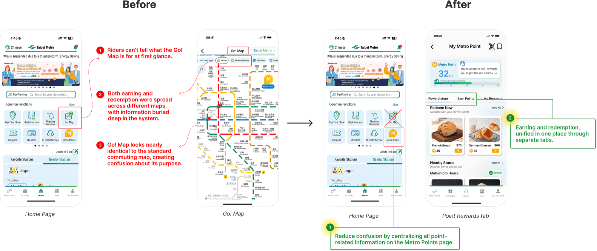
1. Give Metro Points a Clear Home
Impact: Users have a clear entry point for Metro Points, reducing confusion and improving discoverability.
Before the redesign, riders had to rely on Go! Map to discover where they could earn or redeem Metro Points.
Because earning activities and rewards were tied to specific stations, users were forced to scan the map to figure out which stations offered campaigns, where rewards could be redeemed, and how points could be earned, adding cognitive load and making points feel hard to access.
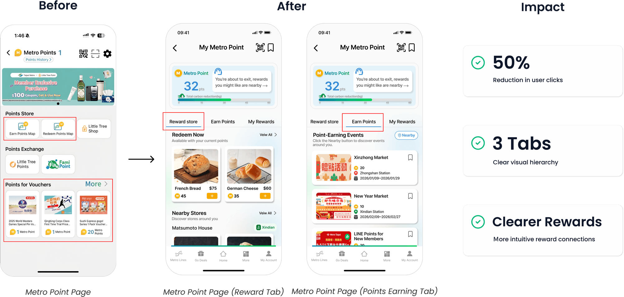
I removed Metro Points from the cluttered Go! Map experience and consolidate all point-related information into a single, dedicated entry.
2. Redefining Metro Points as a Meaningful Reward System
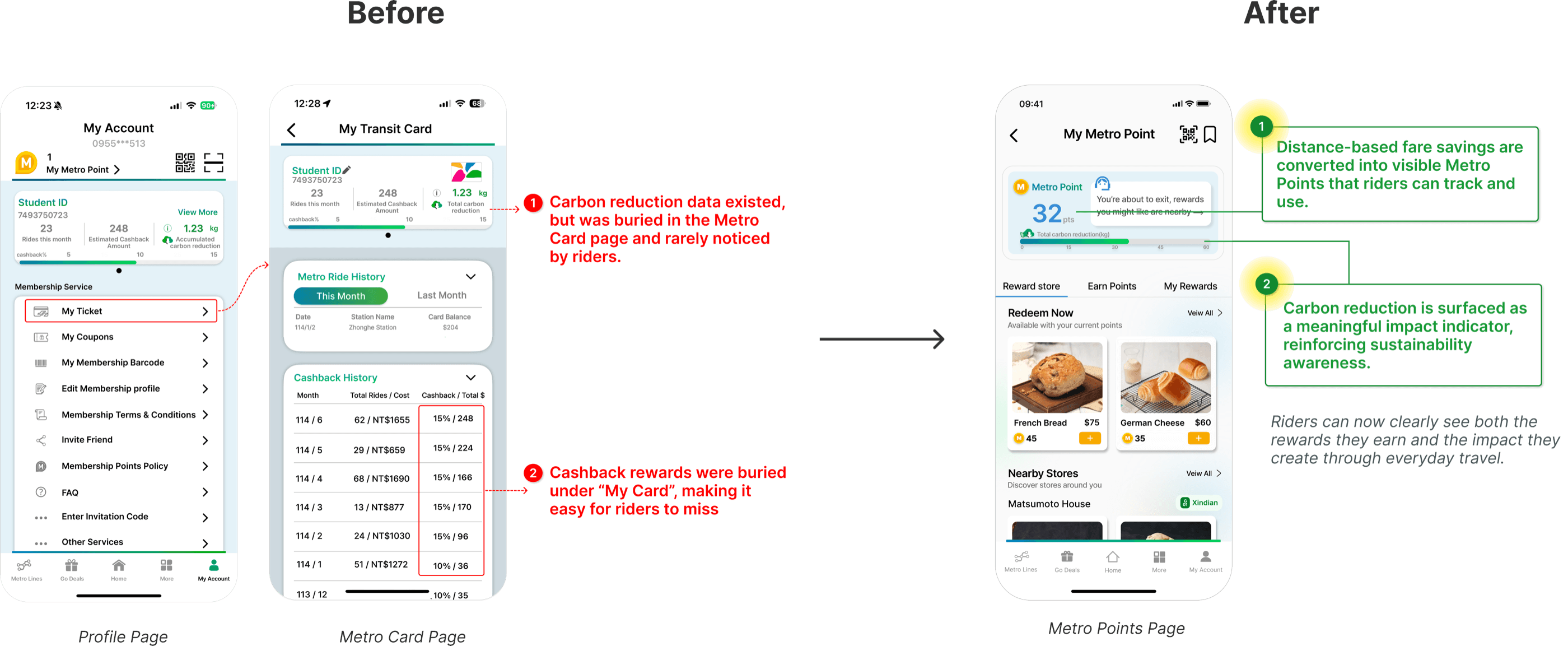
Impact: Users see the value of everyday commuting, while point-based rewards drive foot traffic to station-area stores and non-fare revenue for Taipei Metro.
During research, I discovered that Taipei Metro was already incentivizing frequent riders through distance-based fare discounts and cashback. However, these benefits were buried in the Metro Card information page, and most riders, including myself, barely noticed them.
At the same time, Metro Points struggled to function as a meaningful reward system on its own:
- Points were mostly earned through temporary campaigns
- Explanations about how earning worked were easy to miss
- For new riders, point accumulation felt confusing and not worth the effort
As a result, neither system helped riders clearly recognize or engage with the value of everyday commuting.
our Insight:
Through research, I identified a gap between hidden fare incentives and an unclear reward system. This insight led our team to reframe Metro Points as a single, visible mechanism that surfaces existing value and gives rewards a clearer, more meaningful role.
What I changed:
- Redefined Metro Points as the primary, visible reward mechanism
→ Converted distance-based fare discounts into visible Metro Points, making everyday savings clear and recognizable. - Unified all earning logic into one system
→ Travel distance and campaigns now contribute to a single point balance, creating a clearer link between riding the metro and earning rewards.
3. Make Rewards Relevant and Actionable
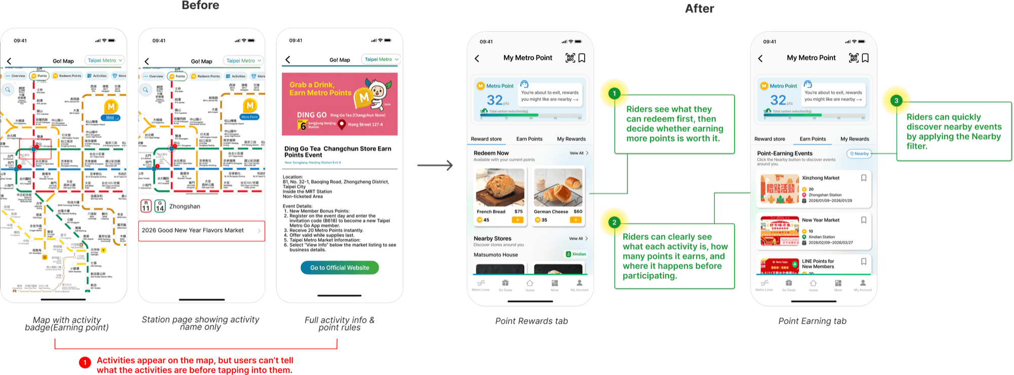
Impact: Users can immediately see what they can earn and redeem, and decide whether to engage without extra effort.
I redesigned the reward experience to answer one clear question upfront:
"How do I earn points—and what can I use them for right now?"
What I changed:
- Rewards are shown with real product images, nearby locations, and required point thresholds
- Users can preview what they can redeem before deciding whether to earn more points
- Point-earning activities are surfaced directly on the Metro Points page, so riders can decide upfront whether they want to engage.
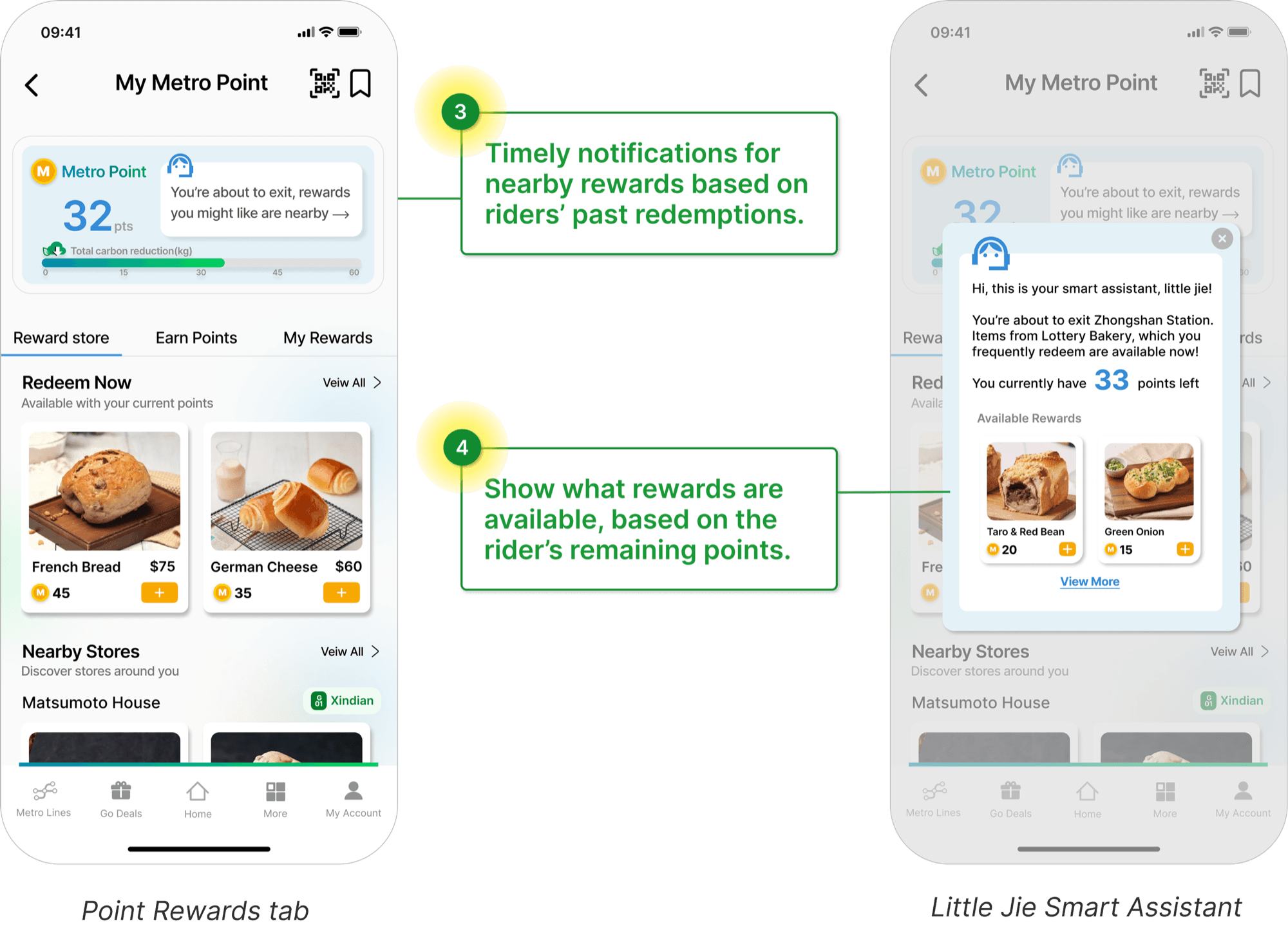
To support this, we introduced Little Jie, a smart reward assistant
What Little Jie Does:
- Detects user’s location and notifies riders at nearby stations with redeemable rewards
- Calculates available redemptions based on point balance
- Personalizes recommendations using past redemption
“There’s a 20% discount at the bakery near Exit 2 — redeem it with 30 points!”
Prioritize Strategy
Balancing user impact, engineering cost, and business dependency
Since this project addressed a real-world financial challenge, time and feasibility were critical.
I prioritized initiatives based on impact, cost, and stakeholder alignment.
Business dependency
1.Redesign Homepage Navigation
- Minimal frontend change (removing Go! Map entry)
- Reduces initial friction and improves journey start rate
2.Restructure Metro Point Page IA
- Requires new interface structure, but leverages existing backend data
- Improves discoverability of earning and redemption information
3.Reframe Metro Point Mechanism
- Requires stakeholder alignment and policy-level adjustments
- Positioned as a longer-term, system-level transformation
Impact
A sustainable, win–win–win ecosystem where better rider experiences drive engagement, partner value, and long-term growth.
By removing friction, restructuring the IA, and reframing the mechanism,
Metro Points became embedded into daily commuting
My Learning
Design must align with existing behavior
Commuting was already part of riders’ daily routines. By integrating rewards into that natural behavior instead of requiring extra effort, engagement became more intuitive and sustainable.
Design decisions must account for business goals and feasibility
Strong user-centered ideas only create impact when they align with organizational priorities and can realistically be implemented